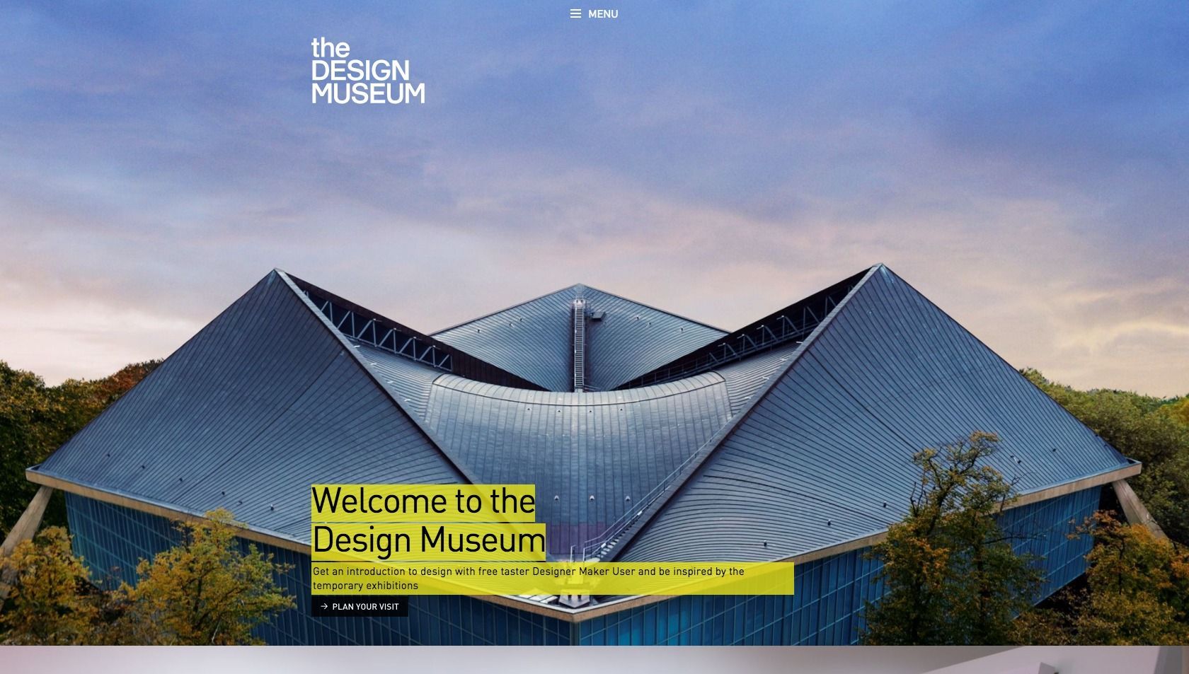
The new Design Museum
Flash back to earlier this year. A phone rings in our office and we answer. On the other end of the line, a request: are we interested in pitching our vision of a new site for the Design Museum in London?
Well, of course! But where?
London. Duh. That makes sense. So Jasper gets on a plane and heads out to England with our friends at Fabrique to talk about our ideas for how things should work on the web.
We get a call back during the return flight. They have to admit they’ve fallen in love. And so have we.
Five months later
Five months later, and the new website for Design Museum London is live. And it was noticed immediately. Within a few hours excited tweets were popping up everywhere. Reading all the responses was a lot of fun.
When the Design Museum proudly announced the new site to its million followers on Twitter, we kept an eye on how well the site held up under the strain of all these curious new visitors.
Luckily our preparation work paid off — our automatic scaling setup in Azure kept things running smoothly. We secretly knew it would, but the proof of the pudding obviously comes with the eating. In other words, the proof of the performance lies in the load times. And those turned out to be smooth, constant and low.
About the site
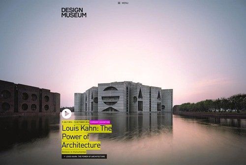
The new Design Museum offers visitors practical information about visiting the museum and its exhibitions, such as Louis Kahn. Exhibition pages include a highlight of the exhibition, related events and the opportunity to buy tickets.
The “design and designers” section focuses on everything about design. Like this article about the Dutch designer Wim Crouwel.
The Design Museum is also the only museum where you can actually buy the collection. Our friends at Fabrique not only worked with us on the site, but also built the online shop and wrote about how they handled their part of the project. You can read more about it on their website.
Meet the team
We spoke to two Q’ers who worked on the site: Guido Bouman, interaction engineer, talked to us about his work on the front end. And Michiel — Microsoft guy — Post explained how he built the back end.
Guido Bouman
What are you most proud of?
That all the animations were built with CSS. We use Javascript to add a class to an element and the CSS does the rest. This ensures that you get maximum performance on all devices and that the Javascript stays nice and simple. Making sure your website always runs at a smooth 60 fps is something designers often underestimate. Janky animation or scrolling can completely ruin the experience for the end user.
Another thing I’m proud of is how simple the grid turned out to be. The responsive grid only really has two breakpoints. 20 pixels space on small screens, 40 pixels on larger screens. The entire website was also divided into modules, which you’ll also find in the CSS. By keeping the CSS simple we avoided quite a number of headaches.
What is design, anyway?
“Design reveals, art hides” is a quote I heard recently from my colleague Rahul. Here’s what I mean by that: design is about effectively communicating a message. Design doesn’t just end at colours and shapes. As an interaction engineer you’re tasked with bringing a static design to life and making it as intuitive as possible for the end user. That’s also part of design.
What was the toughest part of building the site?
Next question? Nah, just kidding!
Technically speaking everything about the new site is simple. There’s no strange interaction, no complicated animation. And that was exactly our intention. It’s the combination of a lot of small things that are just a little out of the ordinary that secretly make the site quite complex.
Some of the more challenging elements include a menu and a footer that are both fixed beneath the actual page, a smart menu bar that appears when you need it, a grid that appears as you start reading the page and a large background image that’s fixed behind the content. Together these form a more complex whole than you’d expect. This also took us by surprise, leading to me growing quite a few extra grey hairs. At least grey looks good on me!
Michiel Post
What are you most proud of?
That we were able to use a lot of new technology and libraries and kept the codebase clean and comprehensive without getting complex. Each web request is handled asynchronously and all database queries are async too. While the database is being waited on, the server is free to handle another request.
Go on…
We used NConfig to automatically configure the different environments the site runs in (develop, test, acceptance, production). This works perfectly with Azure, making it possible to set up a complete new environment running the right configuration in a few minutes.
We also used AppVeyor to manage our builds and deploys, which helped accelerate the speed of development and deployment. Each commit we made was immediately built and pushed onto the test environment. AppVeyor is easy to understand for everyone, which is why members of the team aren’t afraid to make changes or deploy code.
The combined power of Azure, NConfig and AppVeyor really become apparent when I was asked to set up an extra test environment for another branch. Within a few minutes, I’d added a new site in Azure, passed it the test environment’s configuration through NConfig and set up automatic deploys from that branch to the test environment through AppVeyor.
Take a look
The new Design Museum has launched at http://designmuseum.org. We’d love to hear what you think!