Tyrian demo in pure CSS without Javascript or HTML

I was playing around in Chrome trying to see how many DOM elements the browser would give me if I had just one html tag… this one:
<link href=”nojs.css” rel=”stylesheet”>My experiment ended up looking like this:
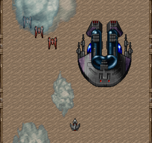
Using images from the OpenTyrian project it became a vertical scrolling shoot-‘em-up where you can fly left and right, see a wave of enemies and finally a boss ship. You can’t fire, it only works in Chrome (due to my lack of time) and it has many glitches, but I thought I’d put it online just for the fun of it.
Here it is:
https://q42games.com/demos/nojs
Be sure to view the source :)
Allow me to briefly go over the technical details for your entertainment.
Working with the DOM
First of all, even though the html file only contains one link tag, it does create this entire DOM structure for us:
<html>
  <head>
    <link href=”nojs.css” rel=”stylesheet”>
  </head>
  <body>
  </body>
</html>
So we’ve got 4 elements to go with. Using the :before and :after pseudo classes for each of these elements we extend our set to 12.
Controlling the spaceship without javascript
In order to move the spaceship I had to come up with a way to have control over it without actually coding. To do that, I had to rely on a combination of nesting, :hover and carefully positioning these hoverable elements.
Take a look at the following picture:
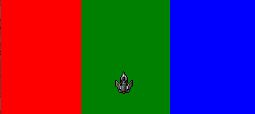
Red is the <html> element. It actually covers the entire page width, but I’ve made its child element <head> (green here) take up 33% width and be positioned in the center of the screen. In a similar way, the <link> element also takes up 33% width but is positioned on the right (pictured in blue here).
Finally, the link:after element is used to present the ship, so the following :hover rules allow us to control the ship:
html:hover link:after {
  -webkit-transform: translateX(-700%);
}

html:hover head:hover link:after {
  -webkit-transform: translateX(0);
}

html:hover head:hover link:hover:after {
  -webkit-transform: translateX(700%);
}
(Please consider the webkit vendor prefix and the 700% things my laziness, and beside the point).
Using a transition, the ship will move to the left or right dependant on where the mouse is :)
Embedding images inside CSS
This one is faily simple. I took a few images from the OpenTyrian project and ran them through dataurl.net in order to get them back as base64 encoded data urls.


In the CSS file, the spaceship is loaded up like so:
link:after {
  background-image: url(data:image/png;base64,iVBORw0KGgoAAAANS…);
}
Vertical scrolling and enemy waves
Getting the action up and running is actually the most simple. I used CSS animations. The background is just one repeating tile that I applied an animation to which offsets the background-position:
@-webkit-keyframes scroll {
  from { background-position: 0 0;}
  to { background-position: 0 48px;}
}
And the enemy wave is similar. I didn’t spend too much time on the wave pattern, it’s fairly straightforward.
@-webkit-keyframes wave {
  0% { -webkit-transform: translate(-300px, 0px); }
  10% { -webkit-transform: translate(300px, 350px); }
  15% { -webkit-transform: translate(-300px, 250px); }
  20% { -webkit-transform: translate(300px, 100px); }
  25% { -webkit-transform: translate(-300px, 50px); }
  35% { -webkit-transform: translate(0px, 300px); }
  45% { -webkit-transform: translate(-100px, 75px); }
  50% { -webkit-transform: translate(0px, 50px); }
  60% { -webkit-transform: translate(75px, 1000px); }
  100% { -webkit-transform: translate(75px, 1000px); }
}
By specifying a short delay between the moment these animations kick in for each enemy, you get a bit more of a real wave effect:
head:before {
  -webkit-animation: wave 20s infinite ease-in-out 8s;
}

body:after {
  -webkit-animation: wave 20s infinite ease-in-out 8.2s;
}

head:before {
  -webkit-animation: wave 20s infinite ease-in-out 8.4s;
}
Last minute touches
Now that my DOM elements were all used, I wondered if I could add a visual image to the left and right edge of the screen. The solution: border-images!
I used the folling image and only specified it to slice up a left and right border image (instead of each corner or all 9 possible parts):
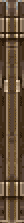
Being 24 pixels wide that includes both sides I had to define the left and right parts only to take up 12 pixels. In the CSS it looks like this now:
html {
  border-image: url(data:image/png;base64,…) 0 12 0 12 repeat;
}
The result
Here’s the demo. Use the mouse to fly left or right:
https://q42games.com/demos/nojs
Final thoughts
This was just an experiment. I took several shortcuts such as only focusing on Chrome or trying to get full control over the ship’s left/right position (I’ve taken a 700% positioning approach just seemd to work for most browser proportions).
I could go and fix that using media queries and specify other left/right positions for specific screen widths, or see if we can get the ship to fire bullets on the click of a mouse. I have a hunch on how to get that to work, though I’m fine with leaving it at this and letting you fill in the remainders of the puzzle. Feel free to debate other possibilities of enhancing this pure CSS demo.
Thanks,
Check out our Engineering Blog for more in-depth articles on pragmatic code for happy users!