Awesome Stuff for Everyone
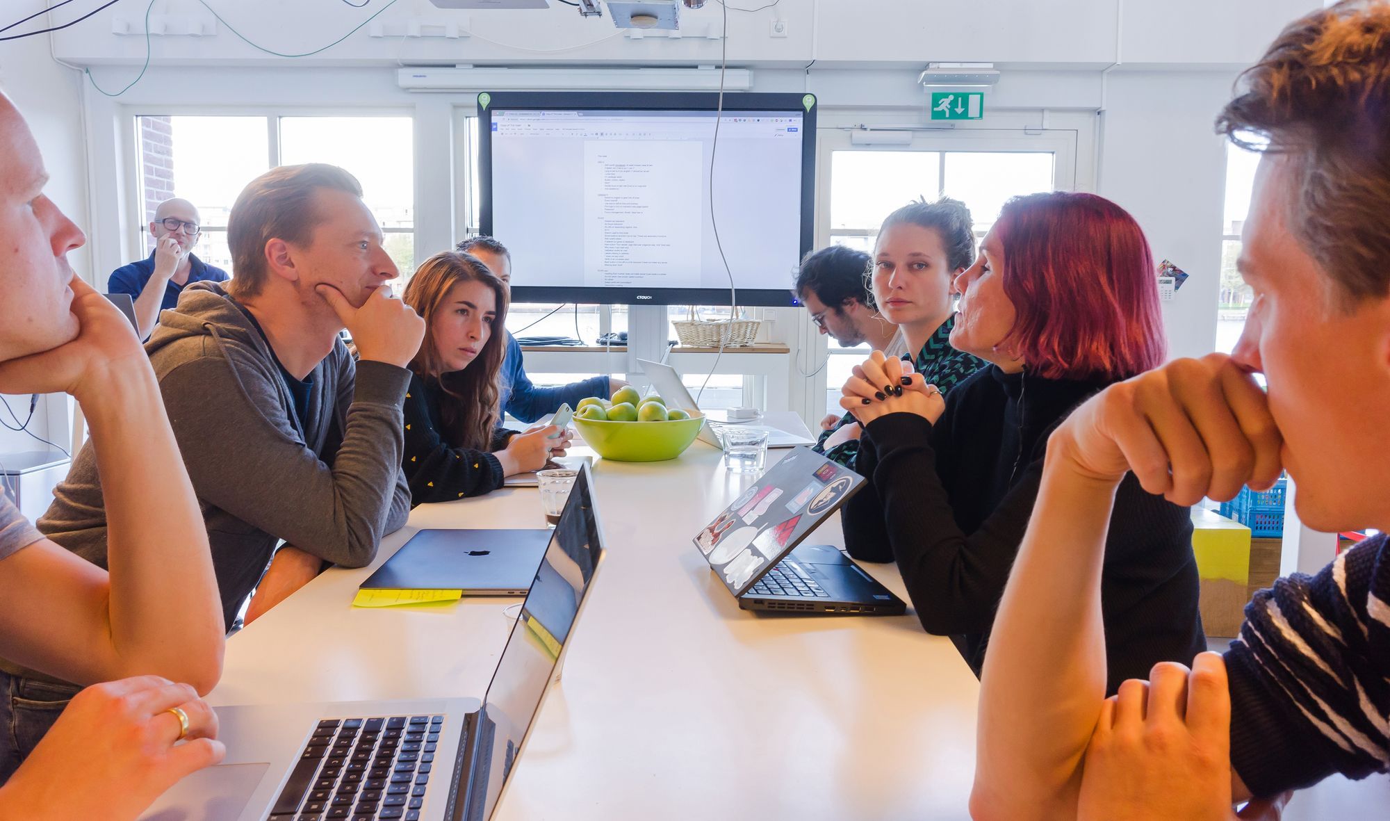
In the past years that I’ve been working at Q42 there have been many moments that I felt very proud of the stuff we’ve been making. I’m privileged to be surrounded by so many bright people. They make me feel like everything is possible. But being surrounded by such clever and skilled people keeps my imposter syndrome lurking around the corner. What can I possibly add to a team when the bar is so high? What will be my added value? These questions kept me searching for the missing ingredient in our formula for making awesome stuff.
The missing ingredient
At Q42 we try to keep our focus on the user with everything we make. As an Interaction Engineer my main goal is keeping this focus throughout the whole project. To do so you need to have a thorough understanding of who this end user is. Most of the time our team, including our client, has a pretty good idea. But do we?
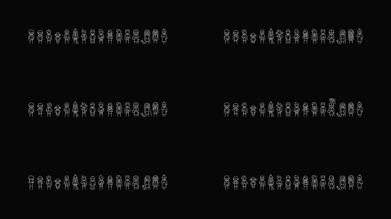
Most of the time our focus lies on people like us. Who experience digital media like we do. Who can see, hear, touch and understand like we do. While most of our users fit this description there is still a very large group that does not. This seems to be the missing ingredient in our formula. That’s where I can add value. By keeping focus on all of our users. Including the ones we tend to forget about. So we can create awesome stuff for everyone.
Who is everyone?
To answer that question I started my project empat.io a few years ago. My aim was to help designers and developers understand more about users they don’t meet every day. In order to make them think about accessibility and inclusive design they have to see actual people using their products. The bitesize videos on empat.io are there to help them understand the specific needs of large groups of their users. But it is even better to meet people and watch them struggle with your product. Every now and then I invite someone to meet with a team and show them what it is like for him or her to use stuff we are making. That’s why I invited Léonie Watson to come and visit us at Q42. Well, actually she invited herself.
Better to do something than nothing at all
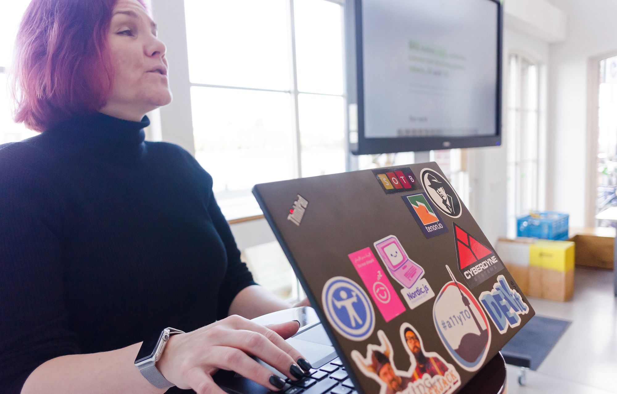
A few months ago Léonie visited Q42 together with her fellow chairmen/women of the W3C Web Platform Working Group to work on the future of HTML5 specs. When we talked I found out that we shared a pragmatic view on accessibility that boils down to this: It is always better to do something than to do nothing.
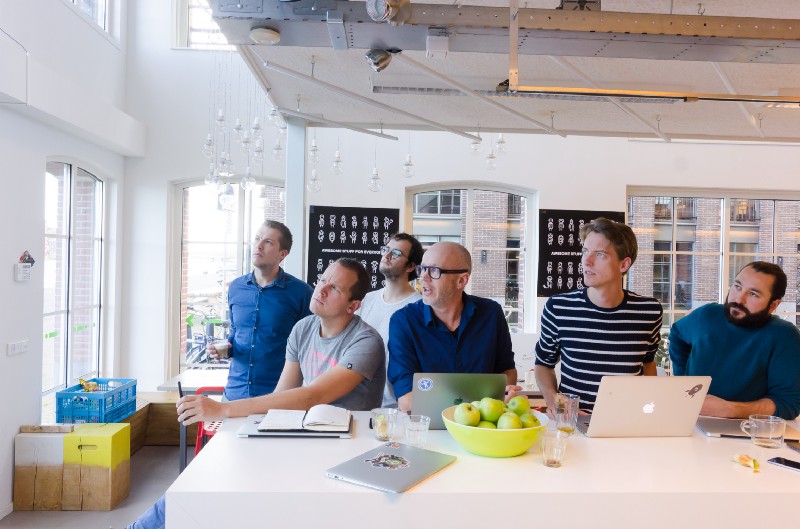
She grew fond of our happy place for nerds and wanted to come back. Now that was an offer I simply couldn’t refuse. Because besides being an experience expert she is one the world’s leading experts on accessibility and inclusive design and wanted to help us make our products better for everyone. I asked her if she would like to participate in something called The Roast of Q42. Where she would use our products in front of us and bluntly tell us what we are doing wrong. But first I wanted her to meet our clients. We organised a meetup called Awesome Stuff for Everyone. A surprisingly large part of our clients turned up. It was very cool to see how many of them care about the subject.
The Roast of Q42
Then came the moment many of us had been waiting for. A bit nervous. Anxious even maybe. We gave Léonie a few tasks to fulfil with some of our products. To our big surprise she was able to fulfil them all. Not without running into some small problems. But that was okay. Because the goal was to learn and make things better. Just like any Roast this was great fun. We laughed about our own mistakes. And with every mistake we got a great explanation. To give you an idea these were some of the common mistakes we made:
- Forgetting labels
We know what to do with the alt-attribute on images. So when we are building web apps we always take care that images have meaningful descriptions or an empty alt-attribute when it’s just decorative. When building apps every now and then we seem to forget to add labels to important parts in the interface. This resulted in Léonie’s screenreader shouting a meaningless “Button!” to her for example. - Setting meaningless labels
Adding labels is not enough if they do not make any sense. In one of our apps the designer added fancy labels to buttons that made it hard for Léonie to understand what would happen when she clicked it. Labels on buttons should describe the action. So something like “Next” or “Previous step” in a form made much more sense to her than descriptions of the content like “Your details” or “Tickets”. - Forgetting buttons or links
At some point she got stuck because the thing we wanted her to do was not a proper link or button at all. It was a span with an event listener attached to it. This was the moment she talked about the importance of ARIA. - Losing focus
She got stuck behind a modal layer. Although she did not notice it. We saw the cursor move behind a popup and a modal layer. When we told her she made it clear how important focus management is.
The Fix
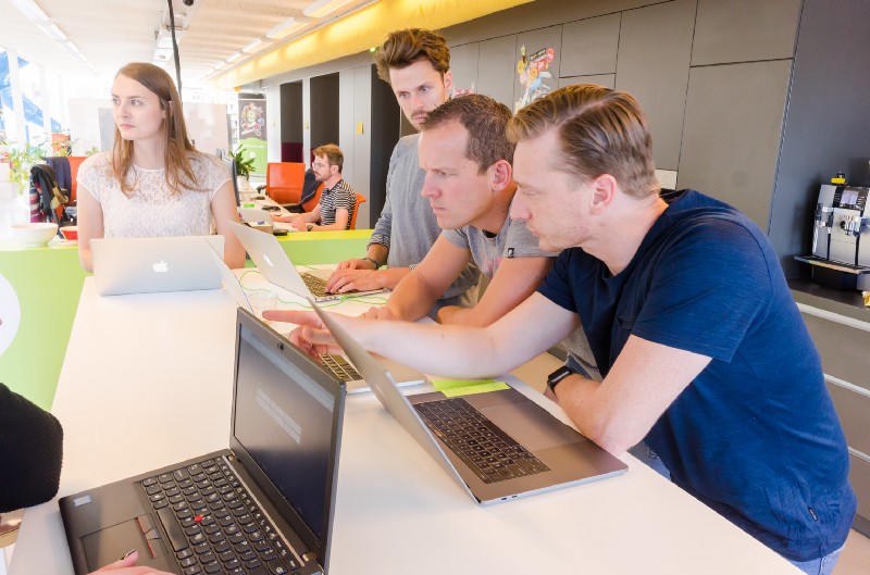
In the afternoon we took time to work on fixing the issues that came out of The Roast. Remember what I said about the feeling that with these people it feels like anything can be done? Well, the afternoon was just that into full effect. We actually made some of our projects more accessible. More accessible than before.
It ain’t that hard
Opposite to popular belief accessibility does not seem to be hard at all. Certainly not if you address it from the beginning of the project. It can even be a lot of fun. As long as you stay pragmatic about it. Every accessibility issue you get fixed is one. Even the smaller, easy to solve issues may help somebody somewhere to use your product who was not been able to do so before.
Value added
It looked like my clever co-workers learned something new and it made them aware of the diversity of our users. We found a new way to improve the quality of our work. It was fun organising the two events, it was extremely useful and it kept my imposter syndrome on a safe distance for a while. I added value by giving new focus. We will definitely do this again.
Just do it!
Awesome Stuff for Everyone may sound very intimidating. And to be honest I think it is impossible to make an experience that fits literally everyone’s needs. But you have to aim for something to get things done. Seeing someone struggle with your product who does not fit your idea of an average user is invaluable. And it will stretch the understanding of who your user actually is. In my experience a team will start making different decisions from that point on. Decisions that will benefit at least a few more users than before. It is always better to do something than to do nothing. Start by taking a step. Even the smallest step has some effect for someone. Just do it!
Also read my article on why inclusiveness is not a nice-to-have in product development.